Integration deep dive
In this section, we will walk through the Forminer integration process on the Vite example.
Prerequistences
In this example, we will use Node and NPM with specific versions as below.
$ node --version
20.19.5
$ npm --version
10.8.2
Create a new project
Create a new project with a typescript template.
npm create vite@latest forminer-vite -- --template react-ts # extra double-dash is needed
Install dependencies
cd forminer-vite && npm install
Forminer requires react and react-dom in versions 18.x.
npm install react@18 react-dom@18
npm install --save-dev @types/react@18 @types/react-dom@18
You can clean up and remove unnecessary files.
rm -r ./src/assets ./src/App.css ./src/index.css
Update the App.tsx file to have an empty component.
function App() {
  return null;
}

export default App;
Remove style import from main.tsx.
import React from 'react';
import ReactDOM from 'react-dom/client';
import App from './App.tsx';
import './index.css';

ReactDOM.createRoot(document.getElementById('root')!).render(
  <React.StrictMode>
    <App />
  </React.StrictMode>,
);
You should end up with the following project structure.
┌── public
│   ├── vite.svg
├── src
│   ├── App.tsx
│   ├── main.tsx
│   └── vite-env.d.ts
├── .eslintrc.cjs
├── .gitignore
├── index.html
├── package.json
├── README.md
├── tsconfig.json
├── tsconfig.node.json
└── vite.config.ts
Install dependencies
Install Forminer
Unzip the forminer file, copy the directory to forminer-vite/packages/forminer and install it.
npm install ./packages/forminer
Install uniforms theme
At this point, you will need one of the uniforms themes. The list of themes is here. You can install any theme, but remember to install it with the 4.0.0-beta.5 version.
For the purpose of this installation example, we will proceed with the uniforms-mui theme. To do it, run the command:
npm install --save-exact uniforms-mui@4.0.0-beta.5
Install Material UI
In the example, the Material UI components will also be used so let's install them too.
npm install @mui/material@6.5.0 @emotion/react @emotion/styled
Material UI uses the Roboto font by default.
npm install @fontsource/roboto
Then you can import it in your entry point (src/main.tsx) like this:
import '@fontsource/roboto/300.css';
import '@fontsource/roboto/400.css';
import '@fontsource/roboto/500.css';
import '@fontsource/roboto/700.css';
Add Forminer component
Go to src/App.tsx file and paste the code as follows.
import {
  createDefaultComponents,
  Form,
  Forminer,
  Provider,
  useForminer,
} from 'forminer';
import * as theme from 'uniforms-mui';
import 'forminer/dist/index.css';

const components = createDefaultComponents(theme);

function App() {
  const { dispatch, state } = useForminer();

  return (
    <>
      <Provider dispatch={dispatch} state={state}>
        <Forminer components={components} />
      </Provider>
      <Form
        components={components}
        definition={state.model.present}
        onSubmit={model => alert(JSON.stringify(model, null, 2))}
      />
    </>
  );
}

export default App;
Add styles to Forminer
Forminer doesn't ship with its font styles. It allows you to pick, which font should be applied. In this example, we will use Google's Rubik font.
Create a new styles.css file in the src/styles.css.
@import url('https://fonts.googleapis.com/css2?family=Rubik:wght@400;500&display=swap');

body {
  font-family: Rubik, sans-serif;
  font-weight: 400;
}
Then, import it into the App.tsx file.
import './styles.css';
Run the application
Use a command:
npm run dev
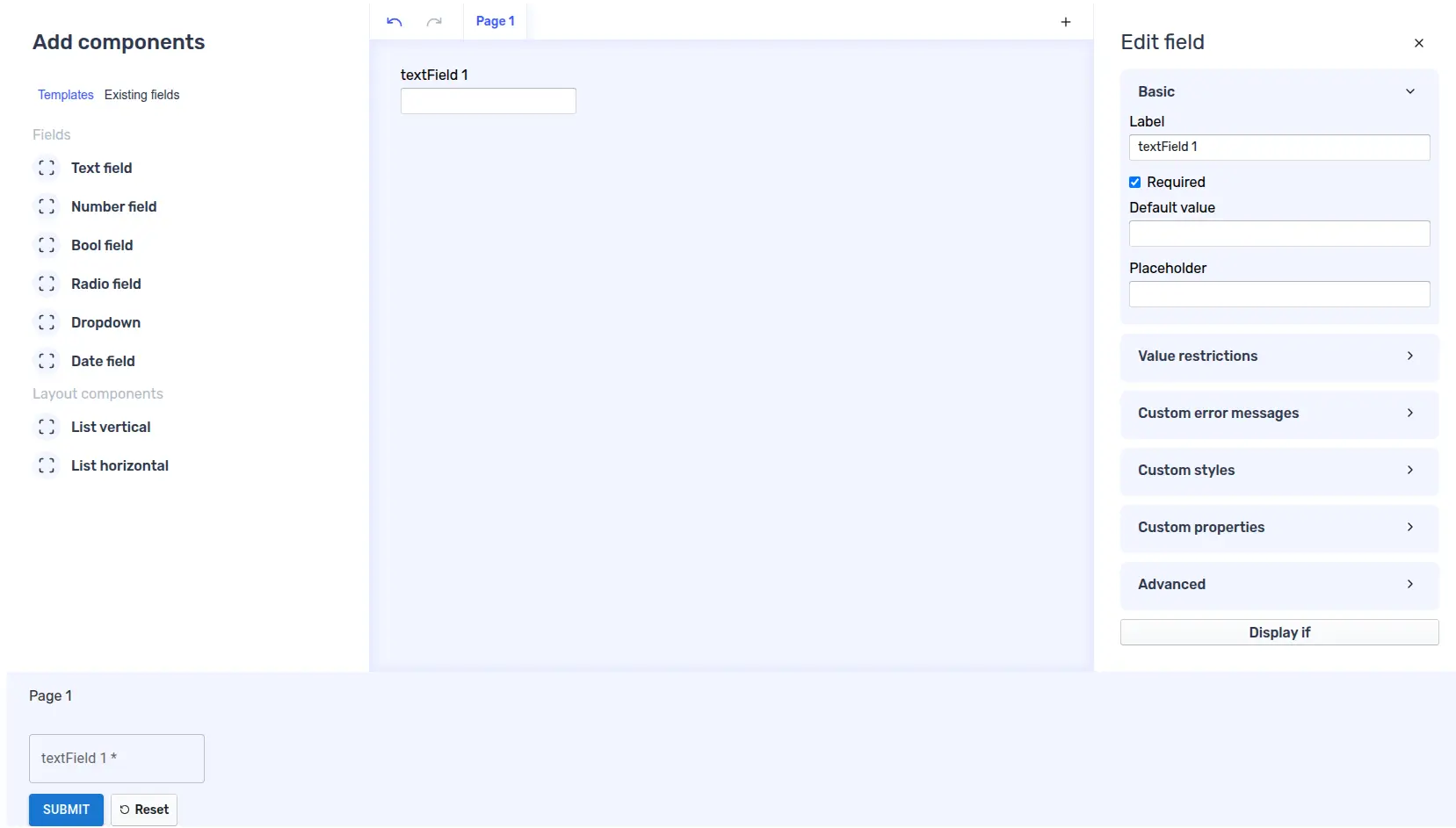
Then, verify your application works as expected. You should see the view presented below: