Integration deep dive
In this section, we will walk through the Forminer integration process on the CRA (create-react-app) example.
node and npm version
Ensure you have the right versions of node and npm. Look at Technical requirements (versions).
Create a new project
Create a new project with a typescript template
$ npx create-react-app [project-name] --template typescript
react and react-dom version
Ensure you have the right versions of react and react-dom. Look at Technical requirements (versions).
If your react and react-dom versions aren't correct you have to downgrade them. To do so follow the steps described in React project version downgrade section.
Install required dependencies
Install the dependencies as described on the Installation page.
Watch out!
If you're using npm at a version higher than 16.14.17 (not recommended) apart from --save-exact flag you will also have to add --legacy-peer-deps. The command will look as follows:
npm i --save-exact --legacy-peer-deps ajv@7.1.1 ajv-errors@2.0.0 ...
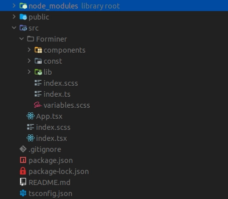
Add Forminer directory
Copy Forminer directory and paste it to the [project-name]/src
Create Forminer's helpers
As your Forminer folder is already present in the src directory, now it's time to add Containers and translations.
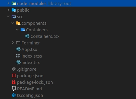
Add containers
Create Containers.tsx file in src/components/Containers
Example code for Containers.tsx can be copied and pasted as below.
See the code
import React, { CSSProperties, Fragment } from 'react';
import classNames from 'classnames';

import { Field as FieldType } from '../../Forminer/const/schemas/field';
import { DragSeparator } from '../../Forminer/components/DragSeparator';
import { render as renderLive } from '../../Forminer/components/Form';
import { render as renderEdit } from '../../Forminer/components/FormEdit';
import { LayoutPlaceholder } from '../../Forminer/components/LayoutPlaceholder';
import { NS } from '../../Forminer/const/namespace';
import { LayoutNode } from '../../Forminer/const/schemas/layout';
import { View } from '../../Forminer/const/schemas/view';
import { Translations } from '../../Forminer/const/types';
import { ComponentDefinitions } from '../../Forminer';
import { ContainerDefinitions } from '../../Forminer/lib/containerDefinitions';
import isLayoutNodeField from '../../Forminer/lib/isLayoutNodeField';
import { WidgetDefinitions } from '../../Forminer/lib/widgetDefinitions';

type ListProps = {
  children: LayoutNode[];
  components: ComponentDefinitions;
  containers: ContainerDefinitions;
  depth: number;
  droppableId: string;
  isDragging: boolean;
  isRoot: boolean;
  nestedDroppableBase: string;
  path: string;
  schema: FieldType[];
  type: string;
  translations: Translations;
  variant: 'horizontal' | 'vertical';
  views: View[];
  widgets: WidgetDefinitions;
};

type FrameProps = {
  children: LayoutNode[];
  components: ComponentDefinitions;
  containers: ContainerDefinitions;
  depth: number;
  droppableId: string;
  isDragging: boolean;
  isRoot: boolean;
  nestedDroppableBase: string;
  path: string;
  schema: FieldType[];
  style: CSSProperties;
  translations: Translations;
  views: View[];
  widgets: WidgetDefinitions;
};

const containers: ContainerDefinitions = {
  List: {
    componentEdit: function List({
      children,
      components,
      containers,
      depth,
      droppableId,
      isDragging,
      isRoot,
      nestedDroppableBase,
      path,
      schema,
      type,
      translations,
      variant,
      views,
      widgets,
    }: ListProps) {
      const containerType = variant + type;
      return (
        <div
          className={classNames(
            `${NS}-${containerType}`,
            `${NS}-${containerType}--edit`,
            {
              [`${NS}-full-height`]: isRoot && children.length === 0,
            },
          )}
        >
          {children.length === 0 && (
            <LayoutPlaceholder
              droppableId={droppableId}
              fitAvailable={isRoot}
              isDragging={isDragging}
              type={containerType}
              translations={translations}
            />
          )}

          {children.length > 0 && (
            <div
              className={classNames(
                `${NS}-${containerType}`,
                `${NS}-${containerType}--edit`,
              )}
            >
              {children.map((layout, index) => (
                <div
                  className={classNames(
                    `${NS}-dnd-draggable`,
                    `${NS}-dnd-draggable-${containerType}`,
                  )}
                  key={layout.layoutId}
                >
                  <>
                    {!isDragging && (
                      <DragSeparator
                        droppableId={`${nestedDroppableBase}${index}`}
                        type={containerType}
                      />
                    )}
                    {renderEdit({
                      components,
                      depth: depth + 1,
                      layout,
                      path: `${path}.children.${index}`,
                      schema,
                      translations,
                      views,
                      widgets,
                      containers,
                    })}
                  </>
                </div>
              ))}

              {!isDragging && (
                <DragSeparator
                  droppableId={`${nestedDroppableBase}${children.length}`}
                  isRoot={isRoot}
                  isLast
                  type={containerType}
                />
              )}
            </div>
          )}
        </div>
      );
    },
    componentLive: function List({
      children,
      components,
      containers,
      depth,
      path,
      schema,
      type,
      variant,
      views,
      widgets,
    }: ListProps) {
      const containerType = variant + type;
      return (
        <div className={`${NS}-${containerType}`}>
          {children.map((layout, index) => {
            const id = isLayoutNodeField(layout)
              ? `${layout.viewId}${index}${depth}`
              : `${index}${depth}`;

            return (
              <Fragment key={id}>
                {renderLive({
                  components,
                  containers,
                  depth: depth + 1,
                  layout,
                  path: `${path}.children.${index}`,
                  schema,
                  views,
                  widgets,
                })}
              </Fragment>
            );
          })}
        </div>
      );
    },
    configSchema: {
      type: 'object',
      properties: {
        variant: { type: 'string', enum: ['horizontal', 'vertical'] },
      },
      required: ['variant'],
    },
  },
  Frame: {
    componentEdit: function Frame({
      children,
      components,
      containers,
      depth,
      droppableId,
      isDragging,
      isRoot,
      nestedDroppableBase,
      path,
      schema,
      style,
      translations,
      views,
      widgets,
    }: FrameProps) {
      const containerType = 'Frame';
      return (
        <div
          className={classNames(
            `${NS}-${containerType}`,
            `${NS}-${containerType}--edit`,
            {
              [`${NS}-full-height`]: isRoot && children.length === 0,
            },
          )}
        >
          <div style={{ border: `${style}` }}>
            {children.length === 0 && (
              <LayoutPlaceholder
                droppableId={droppableId}
                fitAvailable={isRoot}
                isDragging={isDragging}
                type={containerType}
                translations={translations}
              />
            )}

            {children.length > 0 && (
              <div
                className={classNames(
                  `${NS}-${containerType}`,
                  `${NS}-${containerType}--edit`,
                )}
              >
                <div
                  className={classNames(
                    `${NS}-dnd-draggable`,
                    `${NS}-dnd-draggable-${containerType}`,
                  )}
                  key={children[0].layoutId}
                >
                  {!isDragging && (
                    <DragSeparator
                      droppableId={`${nestedDroppableBase}0`}
                      type={containerType}
                    />
                  )}
                  {renderEdit({
                    components,
                    depth: depth + 1,
                    layout: children[0],
                    path: `${path}.children.0`,
                    schema,
                    translations,
                    views,
                    widgets,
                    containers,
                  })}
                </div>

                {!isDragging && (
                  <DragSeparator
                    droppableId={`${nestedDroppableBase}0`}
                    isRoot={isRoot}
                    isLast
                    type={containerType}
                  />
                )}
              </div>
            )}
          </div>
        </div>
      );
    },
    componentLive: function Frame({
      children,
      components,
      containers,
      depth,
      path,
      schema,
      style,
      views,
      widgets,
    }: FrameProps) {
      return children.length > 0 ? (
        <div className={`${NS}-field-container`}>
          <div style={{ border: `${style}` }}>
            <Fragment>
              {renderLive({
                components,
                containers,
                depth: depth + 1,
                layout: children[0],
                path: `${path}.children.0`,
                schema,
                views,
                widgets,
              })}
            </Fragment>
          </div>
        </div>
      ) : null;
    },
    configSchema: {
      type: 'object',
      properties: {
        style: { type: 'string' },
      },
    },
  },
};

export default containers;
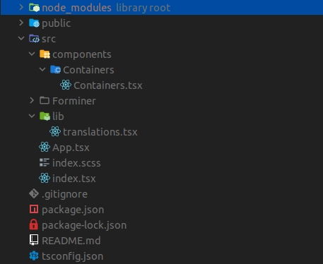
Add translations
Create translations.tsx file in src/lib.
Example code for translations.tsx can be copied and pasted as below.
See the code
import React from 'react';

import { NS } from '../Forminer/const/namespace';
import { Translations } from '../Forminer/const/types';

const translations: Translations = {
  AddComponents: 'Add components',
  AddCondition: 'Add condition',
  AddCustomProperty: 'Add custom property',
  AddCustomStyle: 'Add custom style',
  AddInitialExpression: 'Add initial expression',
  AddLevel: 'Add level',
  AddPredefinedValue: 'Add predefined value',
  AddToSection: 'Add to section',
  Advanced: 'Advanced',
  Basic: 'Basic',
  BoolField: 'Bool field',
  ComponentLabel: 'Component',
  ComponentTooltip: 'Select the component to be used in the form',
  CreateNewCustomComponentTooltip: 'Create new custom component',
  CustomComponents: 'Custom components',
  CustomErrorMessages: 'Custom error messages',
  CustomErrorMessageConstLabel: 'Const',
  CustomErrorMessageDefaultLabel: 'Default',
  CustomErrorMessageEnumLabel: 'Predefined values error',
  CustomErrorMessageFormatLabel: 'Format',
  CustomErrorMessageMaximumLabel: 'Maximum',
  CustomErrorMessageMaxLengthLabel: 'Max length',
  CustomErrorMessageMinimumLabel: 'Minimum',
  CustomErrorMessageMinLengthLabel: 'Min length',
  CustomErrorMessageMultipleOfLabel: 'Multiple of',
  CustomErrorMessagePatternLabel: 'Pattern',
  CustomErrorMessageRequiredLabel: 'Required',
  CustomProperties: 'Custom properties',
  CustomStyles: 'Custom styles',
  Cancel: 'Cancel',
  Confirm: 'Confirm',
  ContainerName(type, variant) {
    return variant ? `${type} ${variant}` : type;
  },
  DateField: 'Date field',
  DefaultValueLabel: 'Default value',
  DeleteAllPredefinedValues: 'Delete all predefined values',
  DisplayIf: 'Display if',
  DisplayIfTitle(name: string) {
    return (
      <>
        Display <span className={`${NS}-display-if-title-field`}>{name}</span>{' '}
        if
      </>
    );
  },
  DisplayIfTooltip:
    'Define the conditions when the given field should be displayed',
  Dropdown: 'Dropdown',
  DropFormComponent: 'Drop a form component here',
  DuplicateField: 'Duplicate field',
  DuplicateFieldTooltip: 'Duplicate field',
  EditComponent: 'Edit component',
  EditField: 'Edit field',
  EditFieldTooltip: 'Edit field',
  EditItem: 'Edit item',
  EditLayoutComponent: 'Edit layout component',
  EditPageName: 'Edit page name',
  EditSection: 'Edit section',
  ErrorDefinitionNotFound: 'Definition not found: "AutoForm".',
  ErrorFieldNotFound(fieldId) {
    return `Field not found: "${fieldId}".`;
  },
  ErrorViewNotFound(viewId) {
    return `View not found: "${viewId}".`;
  },
  ExistingFields: 'Existing fields',
  Field: 'field',
  Fields: 'Fields',
  Frame: 'Frame',
  FormatLabel: 'Format',
  FormatTooltip: 'Select format of value of the field',
  Horizontal: 'Horizontal',
  Is: 'is',
  LabelLabel: 'Label',
  LayoutComponents: 'Layout components',
  LayoutTitle(layoutNodeKind) {
    return `${layoutNodeKind}`;
  },
  ListHorizontal: 'Horizontal section',
  ListVertical: 'Vertical section',
  LiteralFalse: 'False',
  LiteralTrue: 'True',
  MaximumLabel: 'Maximum',
  MaximumTooltip: 'Define maximum value of the field',
  MaxLengthLabel: 'Max length',
  MaxLengthTooltip: 'Define maximum number of characters in a field',
  MinimumLabel: 'Minimum',
  MinimumTooltip: 'Define minimum value of the field',
  MinLengthLabel: 'Min length',
  MinLengthTooltip: 'Define minimum number of characters in a field',
  MultipleOfLabel: 'Multiple of',
  MultipleOfTooltip:
    'The field value should be a multiple of a value defined in this field',
  NameInSchemaLabel: 'Name in schema',
  ModelErrorsMessage: 'Your model contains errors',
  NextPage: 'Next Page',
  NumberField: 'Number field',
  OfTheFollowingAreTrue: 'of the following are true',
  OperatorAND: 'Every',
  OperatorBooleanLiteral: 'Arbitrary boolean',
  OperatorEQ: 'Equal to',
  OperatorGTE: 'Greater than or equal to',
  OperatorGT: 'Greater than',
  OperatorLengthOf: 'Length of',
  OperatorLTE: 'Less than or equal to',
  OperatorLT: 'Less than',
  OperatorNAND: 'Not every',
  OperatorNOR: 'None',
  OperatorNotEQ: 'Not equal to',
  OperatorNumberLiteral: 'Arbitrary number',
  OperatorOR: 'Some',
  OperatorStringLiteral: 'Arbitrary string',
  OperatorValueOf: 'Value of',
  OperatorXOR: 'Only one',
  PageNameLabel: 'Name',
  PagesLongForm: (
    <>
      <div style={{ fontWeight: 'bold' }}>
        That looks like quite a long form!
      </div>
      <br />
      <div>
        Consider spreading your fields into pages to make your form more
        accessible.
      </div>
    </>
  ),
  PatternLabel: 'Pattern',
  PatternTooltip: 'Define regular expressions pattern',
  PlaceholderLabel: 'Placeholder',
  PlaceholderMax: 'max',
  PlaceholderMin: 'min',
  PreDefinedValues: 'Pre-defined values',
  PropertiesTooltip:
    'Add props which will be implemented in the given Field.JSON format',
  RadioField: 'Radio field',
  Redo: 'Redo',
  RemoveComponent: 'Remove component',
  RemoveField: 'Remove field',
  RemoveFieldTooltip: 'Remove field',
  RemoveItem: 'Remove item',
  RemovePage: 'Remove Page',
  RemovePageConfirmation(pageNumber) {
    return `Are you sure you want to remove entire Page ${pageNumber}? Your fields might be lost.`;
  },
  RequiredLabel: 'Required',
  RequiredTrueLabel: 'Must be true',
  Reset: 'Reset',
  SearchPlaceholder: 'Search for components',
  StyleTooltip:
    'Define CSS styles to be used in rendered container of the field.JSON format',
  Submit: 'Submit',
  Templates: 'Templates',
  TextField: 'Text field',
  Type: 'Type',
  TypeLabel: 'Type',
  TypeTooltip: 'Pick what kind of data will be stored in this field',
  Undo: 'Undo',
  ValueRestrictions: 'Value restrictions',
  Vertical: 'Vertical',
  VisualEditor: 'Visual Editor',
};

export default translations;
Integrate Forminer with the application
Add uniforms theme
At this point, you will need one of the uniforms themes. You can check the list of themes here.
You can install any theme, but remember to install it at 3.4.0 version.
For the purpose of this installation example, we will proceed with uniforms-material theme. To do it run the command:
npm i --save-exact uniforms-material@3.4.0
In the example, the Material UI components will also be used so let's install it too.
npm i --save-exact @material-ui/core@4.11.3
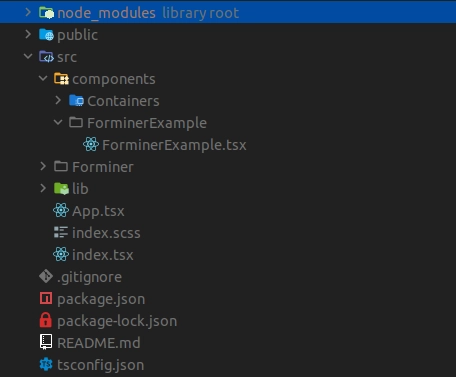
Create example component
Create ForminerExample.tsx file in src/components/ForminerExample.
Example code for ForminerExample.tsx can be copied and pasted as below.
See the code
import React, { useEffect, ReactNode, ReactElement } from 'react';
import Container from '@material-ui/core/Container';
import List from '@material-ui/core/List';
import Paper from '@material-ui/core/Paper';
import * as theme from 'uniforms-material';

import {
  Forminer,
  Provider,
  createDefaultComponents,
  useForminer,
  LayoutNodeKind,
  Form,
} from '../../Forminer';
import containers from '../Containers/Containers';
import translations from '../../lib/translations';

const defaultForm = {
  model: {
    layouts: [
      {
        name: 'Page 1',
        layout: {
          kind: LayoutNodeKind.Container as const,
          children: [],
          type: 'List',
          config: { variant: 'vertical' },
          layoutId: '1',
        },
      },
    ],
    schema: [],
    views: [],
  },
};

type WrapProps = {
  children: ReactNode;
};

const Wrap = ({ children }: WrapProps): ReactElement => (
  <Container maxWidth={false}>
    <Paper elevation={3}>{children}</Paper>
  </Container>
);

const widgets = {};
const components = createDefaultComponents(theme);

export const ForminerExample = (): ReactElement => {
  const { dispatch, state } = useForminer(defaultForm);

  useEffect(() => {
    // do whatever you want with new model
    console.log(state.model.present);
  }, [state.model.present]);

  return (
    <>
      <Wrap>
        <Provider dispatch={dispatch} state={state}>
          <Forminer
            components={components}
            containers={containers}
            translations={translations}
            widgets={widgets}
          />
        </Provider>
      </Wrap>
      <Wrap>
        <Form
          components={components}
          containers={containers}
          definition={state.model.present}
          widgets={widgets}
          translations={translations}
        />
      </Wrap>
      <Wrap>
        <pre>{JSON.stringify(state.model.present, null, 4)}</pre>
      </Wrap>
    </>
  );
};

export default ForminerExample;
Update App.tsx code
Go to src/App.tsx file and paste the code as follows.
See the code
import React, { ReactElement } from 'react';
import ForminerExample from './components/ForminerExample/ForminerExample';

const App = (): ReactElement => {
  return <ForminerExample />;
};

export default App;
Run the application
Use command:
npm start
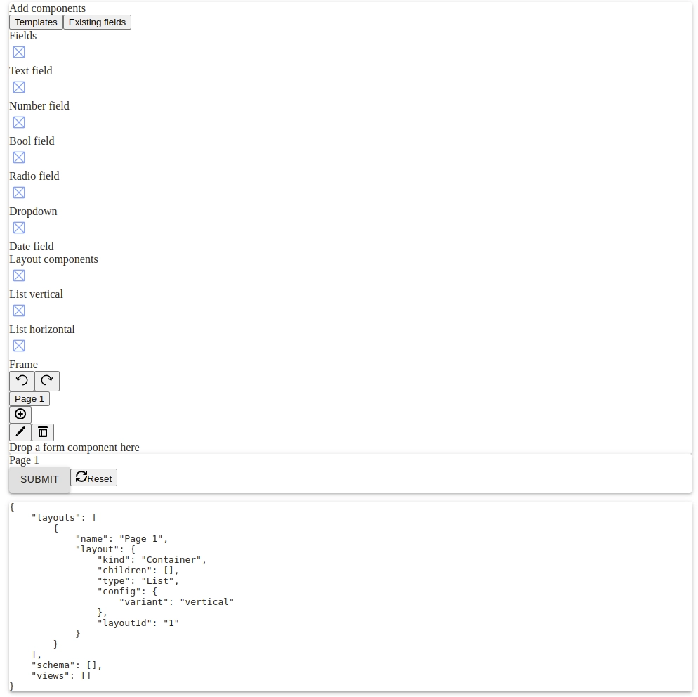
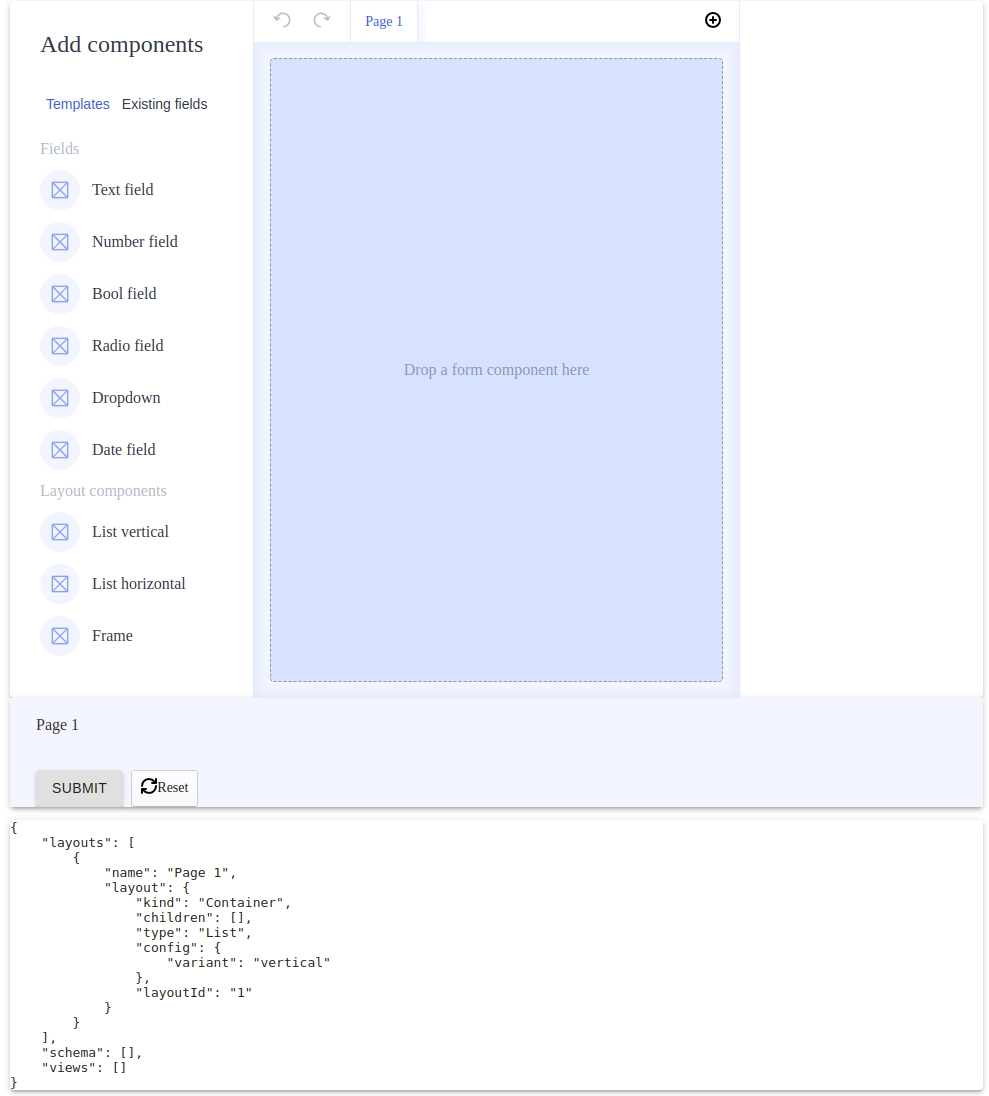
Then, verify your application works as expected. You should see the view presented below:
If you will encounter problems running the app at this point please look at the troubleshooting section.
Add styles
The last part of the installation process is to add the required styles to make FB look the expected way.
- Install Sass. Use the following command:
npm i sass
- Rename
src/index.cssfile toindex.scss - Update
index.scssfile content to be:
See the code
@import './Forminer/variables.scss';
@import './Forminer/index.scss';
- Update
src/index.tsxstyles file import.
From
See the code
import './index.css';
to
See the code
import './index.scss';
- Rerun the application
From now on you can generate the Forminer's code! Have fun!
Optional
React project version downgrade
In this section we'll describe how to downgrade the React project version to the one supported by Forminer.
Change the packages' versions in the package.json
Proper versions of your react packages should be:
See the code
```json
"@testing-library/react": "12.1.5",
"@types/react": "17.0.2",
"react": "17.0.2",
"react-dom": "17.0.2",
```
The dependencies' section should look as follows.
See the code
```json
"dependencies": {
    "@testing-library/jest-dom": "^5.16.5",
    "@testing-library/react": "12.1.5",
    "@testing-library/user-event": "^13.5.0",
    "@types/jest": "^27.5.2",
    "@types/node": "^16.11.68",
    "@types/react": "17.0.2",
    "@types/react-dom": "^18.0.6",
    "react": "17.0.2",
    "react-dom": "17.0.2",
    "react-scripts": "5.0.1",
    "typescript": "^4.8.4",
    "web-vitals": "^2.1.4"
},
```
Remove package-lock.json file and node_modules directory
Be careful and do not delete package.json file.
Install dependencies
To do so run the command:
npm i
Check your index.tsx file
If your file has a code that uses ReactDOM.createRoot and looks like this.
See the code
```tsx
import React from 'react';
import ReactDOM from 'react-dom/client';
import './index.css';
import App from './App';
import reportWebVitals from './reportWebVitals';

const root = ReactDOM.createRoot(
document.getElementById('root') as HTMLElement,
);
root.render(
<React.StrictMode>
    <App />
</React.StrictMode>,
);

// If you want to start measuring performance in your app, pass a function
// to log results (for example: reportWebVitals(console.log))
// or send to an analytics endpoint. Learn more: https://bit.ly/CRA-vitals
reportWebVitals();
```
update it to look as follows
See the code
```tsx
import React from 'react';
import ReactDOM from 'react-dom';
import './index.css';
import App from './App';

const root = document.getElementById('root') as HTMLElement;

ReactDOM.render(
<React.StrictMode>
    <App />
</React.StrictMode>,
root,
);
```
Troubleshooting
If you have problems running the application, please check the Troubleshooting page.