Styling form components
There are multiple ways to style Forminer's components. The most common way to customize the look of the form is to custom theme of uniforms package. There are also other ways to customize the look of the form, such as using CSS styles.
Implementing custom theme
Forminer uses uniforms package to render forms. You can change the theme of components in the Forminer or Form components. To do so, you need to pass the components prop to the Forminer and Form components. Creating custom theme is described in the uniforms documentation. Imported theme can be passed to the createDefaultComponents function to generate the components definitions.
import { Form, Forminer } from 'forminer';
import * as theme from './uniforms-custom-theme';

const components = createDefaultComponents(theme);

return (
  <>
    <Forminer components={components}>
    <Form
      components={components}
      /* the rest of required props */
    />
  </>
)
Using CSS classes
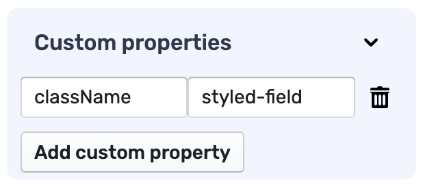
You can also use CSS classes to customize the look of fields. If you have imported stylesheet files into your project, you can use the className prop to apply custom styles to the fields. Forminer editor allows you to pass custom properties to the fields, which can be used to set CSS classes. Setting custom property is available in the edit field view.
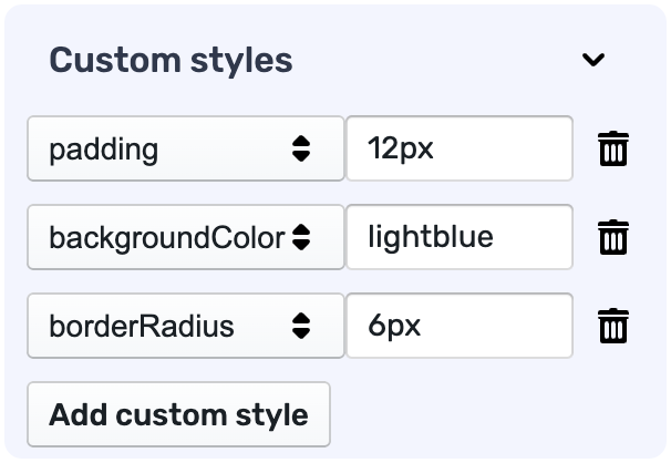
Customizing field styles in the editor
The additional feature in the editor is setting independent styles for each field. It is available in the same view as the custom properties - edit field view.