Custom containers
Forminer offers the ability to create your own custom containers, providing greater flexibility in customizing Forminer to meet individual needs. Containers can be freely nested, allowing you to create universal containers that can be reused with both built-in and custom containers.
Creating a custom container
Let's create an example custom container Section that will group items and allow you to customize 3 properties via UI:
icon- selection of one of the predefined iconstitle- section title (next to the icon)description- section description
Create Section.tsx file in src/components/containers.
Example code for Section.tsx can be copied and pasted as below.
See the code
import {
  type ContainerDefinition,
  LayoutPlaceholder,
  renderEdit,
  renderLive
} from 'forminer';
import { type CSSProperties } from 'react';

/** 3 predefined icons for example purposes */
const ICONS = {
  user: (
    <svg xmlns="http://www.w3.org/2000/svg" width="24" height="24" viewBox="0 0 24 24" fill="none" stroke="currentColor" strokeWidth="2" strokeLinecap="round" strokeLinejoin="round">
      <path d="M19 21v-2a4 4 0 0 0-4-4H9a4 4 0 0 0-4 4v2" />
      <circle cx="12" cy="7" r="4" />
    </svg>
  ),
  form: (
    <svg xmlns="http://www.w3.org/2000/svg" width="24" height="24" viewBox="0 0 24 24" fill="none" stroke="currentColor" strokeWidth="2" strokeLinecap="round" strokeLinejoin="round">
      <rect x="3" y="3" width="18" height="18" rx="2" ry="2" />
      <line x1="9" y1="9" x2="15" y2="9" />
      <line x1="9" y1="13" x2="15" y2="13" />
      <line x1="9" y1="17" x2="13" y2="17" />
    </svg>
  ),
  document: (
    <svg xmlns="http://www.w3.org/2000/svg" width="24" height="24" viewBox="0 0 24 24" fill="none" stroke="currentColor" strokeWidth="2" strokeLinecap="round" strokeLinejoin="round">
      <path d="M14 2H6a2 2 0 0 0-2 2v16a2 2 0 0 0 2 2h12a2 2 0 0 0 2-2V8z" />
      <polyline points="14 2 14 8 20 8" />
      <line x1="16" y1="13" x2="8" y2="13" />
      <line x1="16" y1="17" x2="8" y2="17" />
      <polyline points="10 9 9 9 8 9" />
    </svg>
  )
};

// We use inline styles, but you can use whatever you want for styling
const STYLES: Record<string, CSSProperties> = {
  section: {
    backgroundColor: 'white',
    borderRadius: '8px',
    boxShadow:
      '0 4px 6px -1px rgba(0, 0, 0, 0.1), 0 2px 4px -1px rgba(0, 0, 0, 0.06)',
    paddingTop: '26px',
    paddingBottom: '26px',
    margin: '16px 26px',
  },
  sectionHeader: {
    display: 'flex',
    alignItems: 'center',
    gap: '8px',
    marginLeft: '26px',
    marginRight: '26px',
    marginBottom: '16px',
  },
  sectionIcon: {
    color: '#3d5bff',
  },
  sectionTitle: {
    fontSize: '17px',
    fontWeight: 500,
    letterSpacing: '0.3px',
    color: '#1f2937',
    margin: 0,
  },
  sectionDescription: {
    color: '#4b5563',
    marginLeft: '26px',
    marginRight: '26px',
    marginBottom: '16px',
  },
};

type IconType = keyof typeof ICONS;

/** Custom properties specific for `Section` component (related to `Section.configSchema.properties`) */
type SectionCustomProps = {
  icon: IconType | undefined;
  title: string | undefined;
  description: string | undefined;
}

/** Example of custom layout container */
export const Section: ContainerDefinition<SectionCustomProps> = {
  componentEdit: function Section({
    children,
    components,
    containers,
    depth,
    description,
    droppableId,
    icon,
    isDragging,
    path,
    schema,
    title,
    translations,
    type,
    views,
    widgets,
  }) {
    return (
      <div style={STYLES.section}>
        {(icon || title) && (
          <div style={STYLES.sectionHeader}>
            {icon && (
              <div style={STYLES.sectionIcon}>
                {ICONS[icon]}
              </div>
            )}
            <h3 style={STYLES.sectionTitle}>
              {title}
            </h3>
          </div>
        )}

        {description && (
          <p style={STYLES.sectionDescription}>
            {description}
          </p>
        )}

        {children.length === 0 ? (
          <LayoutPlaceholder
            droppableId={droppableId}
            isDragging={isDragging}
            type={type}
            translations={translations}
          />
        ) : renderEdit({
          components,
          containers,
          depth: depth + 1,
          layout: children[0],
          path: `${path}.children.0`,
          schema,
          translations,
          views,
          widgets,
        })}
      </div>
    );
  },
  componentLive: function Section({
    children,
    components,
    containers,
    depth,
    description,
    icon,
    path,
    schema,
    title,
    views,
    widgets,
  }) {
    if (!icon && !title && !description && !children.length) {
      return null
    }

    return (
      <div style={STYLES.section}>
        {(icon || title) && (
          <div style={STYLES.sectionHeader}>
            {icon && (
              <div style={STYLES.sectionIcon}>
                {ICONS[icon]}
              </div>
            )}
            <h3 style={STYLES.sectionTitle}>
              {title}
            </h3>
          </div>
        )}

        {description && (
          <p style={STYLES.sectionDescription}>
            {description}
          </p>
        )}

        {children[0] && renderLive({
          components,
          containers,
          depth: depth + 1,
          layout: children[0],
          path: `${path}.children.0`,
          schema,
          views,
          widgets,
        })}
      </div>
    );
  },
  configSchema: {
    type: 'object',
    properties: {
      icon: {
        type: "string",
        enum: ["user", "form", "document"],
      },
      title: {
        type: "string",
      },
      description: {
        type: "string",
      },
    },
  },
};
Passing a custom container definition to the Forminer and Forms
We need to create containers containing a map of custom container definitions.
Create containers.ts file in src/components/containers containing the newly created Section.
import { type ContainerDefinitions } from 'forminer';
import { Section } from './Section';

export const containers = {
  Section,
} satisfies ContainerDefinitions;
Now we need to pass containers to the Forminer and Form components as a containers property.
import {
  createDefaultComponents,
  Form,
  Forminer,
  Provider,
  useForminer,
} from 'forminer';
import * as theme from 'uniforms-mui';
import { containers } from './components/containers/containers';

const components = createDefaultComponents(theme);

function App() {
  const { dispatch, state } = useForminer();

  return (
    <>
      <Provider dispatch={dispatch} state={state}>
        <Forminer
          components={components}
          containers={containers}
        />
      </Provider>
      <Form
        components={components}
        containers={containers}
        definition={state.model.present}
        onSubmit={model => alert(JSON.stringify(model, null, 2))}
      />
    </>
  );
}

export default App;
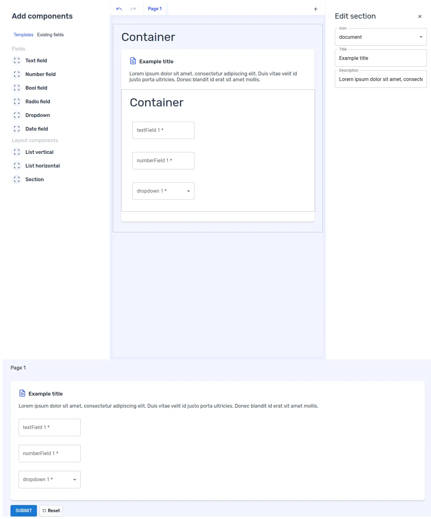
Result
The custom Section component should now be visible and ready to use. Remember that you can combine it with existing containers (e.g. List vertical).